Take a look at this bit of fun that’s on display in MoMA’s atrium until the end of the year. Seemingly rational, mature adults are dancing and flailing their limbs in front of a giant lightbox. This installation is Shadow Monsters by British artist Philip Worthington. Before throwing a shadow up against the wall, it’s first filtered through some custom Java script and physics software. This is the result:
Not only are the images distorted, but motion-generated sounds are added to include chirps, grunts, squeaks and, best of all, great, wallowing belches. Groups of people are fun to watch because they generate the most noise, but there’s a beauty and elegance to watching a lone dancer.
* * *
In honor of the holiday season, American Atheist erected a billboard just north of Times Square.
This is pretty inflammatory stuff and it’s going to offend a lot of people. Some poor mom and pop just want to bring the kiddies to Radio City to watch the Rockettes high-kick. They turn the corner and get smacked with this. The next thing you know, the kids are asking a lot of uncomfortable questions.
The atheists aren’t going to win any converts this way. Aside from the name-calling, they’ve mixed up their holidays. It looks like they’re referring to Easter. My initial reaction was a surprise to myself. Instead of passing judgment on the appropriateness of the message or sparking an internal debate over whether or not God exists, I was overwhelmed with a sense of pride that I live in a democracy. You’d never get away with something like this if you lived in China or the Middle East. Can you imagine if you lived in Iran and put up a big billboard implying that Allah is a myth?! You’d get chopped up into tiny morsels.
And by “I,” I mean “WE,” because there’s no way I could have pulled off a stunt like this on my own.
Back in 2003, I took a class in book binding and letterpress printing at the Center for Book Arts in Manhattan. I had been collecting for quite some time and began to wonder, as most collectors eventually do, how books are constructed. Especially the fancy ones.
That same year, British author Nick Hornby published Songbook. It’s a series of essays about songs that are meaningful to him. It’s still in print and it’s a pretty entertaining read. I’m a big fan of his work and have a healthy collection of signed first editions and rarities.
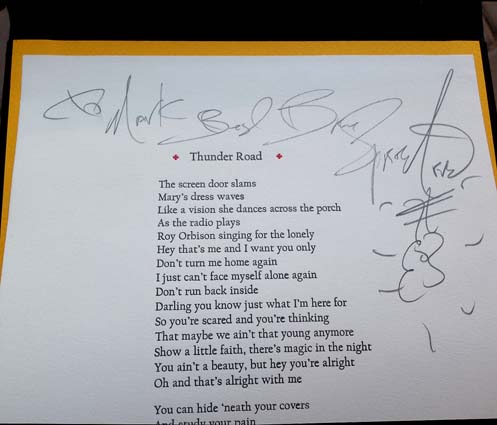
Songbook includes an essay on Bruce Springsteen’s Thunder Road that I think is particularly effective. It’s the standout piece of the book. I was in bookbinding class stabbing myself with a sewing needle trying to perfect a chapbook spine stitch when I had the spark of an idea. Wouldn’t it be cool, I thought, to create a chapbook that married both Hornby’s Thunder Road essay with Springsteen’s lyrics? And do it legitimately, with permission from the artists? Yeah, right. Like that could ever happen.
* * *
I bought a rare Charles Bukowski first edition from Jim, who lived in Phoenix, Arizona. As it turned out, he’s a letterpress printer. He creates beautiful, limited-run books at synaestheia press. He’s a design and production genius. I was a patron of his press and we became pretty good friends. He visited New York City, I visited Phoenix and we also met in Las Vegas once. We spoke all the time.
I told him about my crazy idea for the Thunder Road chapbook. He encouraged me and said that if I could somehow secure permission from Hornby and Springsteen, he would print it. Shortly thereafter, Hornby was on a promotional tour for Songbook. At his Manhattan stop, while getting my copy signed, I casually asked if I could reprint his Thunder Road essay in a chapbook. Much to my surprise, he said yes, with the stipulation that every penny made from the sale go to charity. That was okay by me, since making money never entered my mind. Not once!
Now the tough part. Bruce Springsteen’s business machine is fiercely protective of his material. I thought that going to him with an agreement from Hornby already in-hand would add legitimacy to the project. I wrote to his manager, Jon Landau, and not long thereafter, much to my complete shock, received permission to reprint the lyrics on a letterpress broadside. The stipulation was the same as the one Hornby set out for us; we were not permitted to profit from the venture. All proceeds had to be donated to charity.
We received nothing more than a verbal agreement and a “good luck” from Hornby, however, we received a multi-paged contract from the legal department of Shore Fire Media that we were required to sign and return. It was stipulated, in no uncertain terms, that all monies were to be donated to charity and that we were to use the lyrics provided with the contract (vs. getting them off the internet and possibly misquoting). Pretty serious stuff. The contracts were signed on May 28, 2004.
With my recently acquired knowledge of chapbook construction, I worked up about four different prototypes. The trick was to collapse both the essay and the broadside into one book. I sent them off to Phoenix and, if I’m being completely honest here, the layout ideas that Jim came up with were much better than mine. I wanted the book to be great so it required some humility on my part. The finished layout is probably 80% his talent and 20% my lucky guesses.
Do you know what can dramatically increase the value of a book? A signature. We had another brilliant, impossible, idea. We would fly to London, meet with Hornby, and he would sit and sign a stack of title pages for the essay portion of the book. In early 2006, I sent him, via his publisher at Penguin, a “Hey, remember me? We’re going to be in the neighborhood. How’d you like to sign some title pages?” e-mail. How many authors of Hornby’s stature do you suppose would entertain such a ludicrous request? Damn few, I’d guess. But he agreed to do it. On March 16, 2006, he had us over to his writing studio and for a few hours the three of us bullshitted about music and literature and the internet and he told us some fun stories about dealing with Hollywood, all while signing page after page after page after page.
We were planning a print run of 200 copies. Hornby signed 250 leaves. This is common practice as it allows for overage, contributor copies and damage during construction. Nick developed a terrible hand cramp. I felt kind of bad. Afterwards, he walked with us back to the tube station and took us past the vintage (1913), now demolished, Arsenal stadium, home to his beloved Gunners. It’s one of my top five favorite afternoons ever.
I sent a request to Springsteen asking if he would be willing to sign a portion of the broadsides. I didn’t dare hope that he’d sign all 250. He declined and I didn’t have the nerve to pursue the issue. Frankly, I was surprised that he granted permission to use the lyrics and I didn’t want to push my luck.
* * *
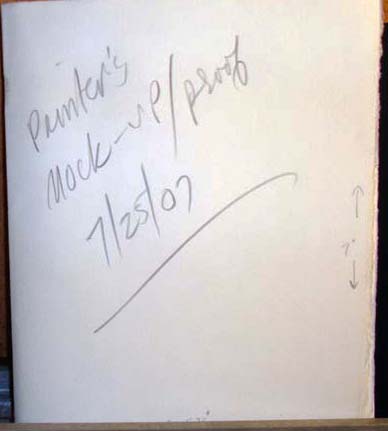
It took a little over a year to produce the printer’s mock-up proof. A year is a bit longer than is customary for this type of work, but there were delays.
And then there were more delays. The months peeled away. I thought the project was becoming a burden, so I offered to find someone else to print it. But Jim is steadfast and a man of his word and always finishes what he starts. The printing commenced slowly.
I don’t recall the specifics (and wouldn’t share them here if I did) but eventually, tensions rose, words were exchanged and we stopped speaking. Our friendship died. And the Thunder Road chapbook project ceased.
In July of 2008 I wrote to Hornby and said that, with deepest regrets, the book would not be made. He wrote a short piece on his blog about how all artistic endeavors begin with good intentions but don’t always come to fruition or a happy ending. He used our book as a case in point.
* * *
Years passed by.
I wrote to Jim last fall and after a few tentative e-mail exchanges, I asked if he wouldn’t mind shipping the guts of the book. He had finished the essays and broadsides but the covers still needed to be printed and the book had to be assembled. He boxed them up carefully and they arrived in New Jersey sometime in December.
* * *
I had some contacts in the letterpress community that led me to Ray at Lead Graffiti, an extraordinary letterpress printer in Delaware. I approached him about the project with the caveat that although I could cover the cost of materials, all the heavy lifting would have to be done pro bono. Would he be interested?
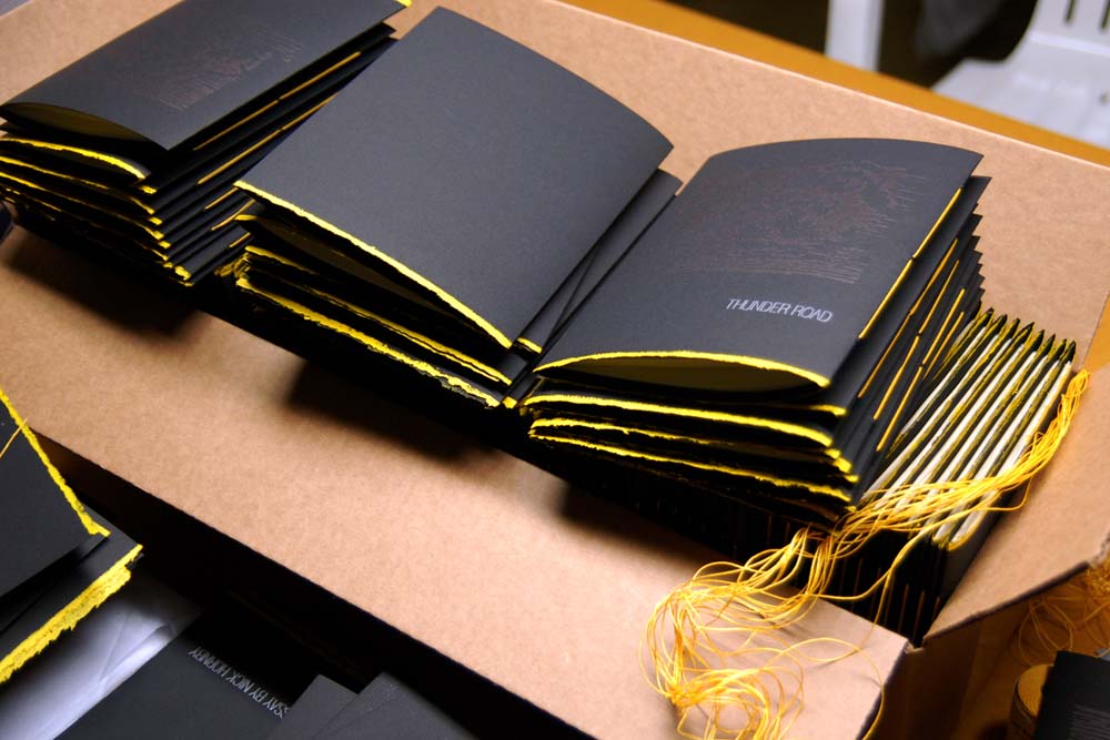
He embraced the project so enthusiastically that in addition to making the 200 softcovers, he decided to create a special run of 26 hardcovers that would sell at a premium. Ray’s partner, Jill, jumped in and created a beautiful linocut stamp of storm clouds to print on the cover.
Here’s Ray slaving away at the printing press.
I was moved by their enthusiasm for the project and willingness to create hardcovers. I meditated on how they could be made even more special. I approached Springsteen again and asked if he would be willing to sign the broadsides for just those 26 copies. He politely declined five years ago, but this time he said yes. I dropped the broadsides off at his house and picked them up several weeks later.
* * *
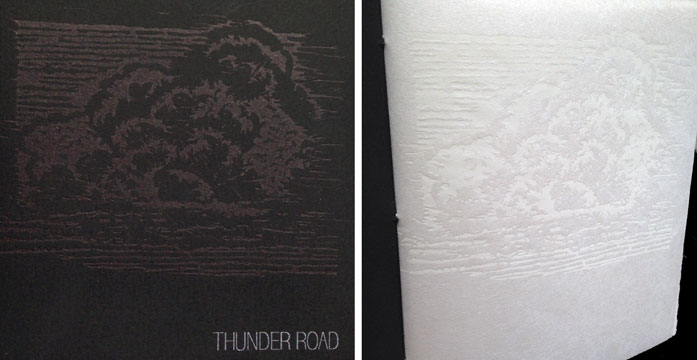
The book has two spines. The essay is bound in on the left spine, and the broadside with the lyrics unfolds from the right. We borrowed the same font from the Born to Run album cover for the title. The covers are printed on black Somerset Velvet and the flysheet for the essay is printed on white mulberry paper.
The linocut is printed black-on-black ink for the cover and repeated in white-on-white for the flysheet.
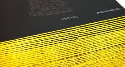
A hand-rolled deckle edge that emulates yellow road paint was added along the bottom.
It’s sewn with matching yellow thread. The hardcovers have yellow endpapers.
The 26 copies signed by both Springsteen and Hornby were priced at $225 and are sold out. But I still have the softcovers to sell. They are priced at $60 each; a steal considering the level of craftsmanship and the content. All copies are signed by Nick Hornby on his essay. Per Hornby and Springsteen’s request, proceeds from the sale are being donated to TreeHouse, a school in London for autistic children.
We created six special sets that are not for sale. One hardcover and one softcover are laid into a custom clam shell case, handmade by Bill of Bottle of Smoke Press, who also assisted with the cover printing. These sets go to Springsteen, Hornby and the four project participants. Bruce was kind enough to inscribe the broadsides for those six copies to each of us. Here’s my hardcover copy. Brothers and sisters, this is all the payment I’ll ever need.
* * *
Getting this book made has been a long, arduous process but the finished product is a small masterpiece. Hardbound copies were purchased for the special collection libraries at Columbia University, The University of Delaware and The Newark Library. There’s also a copy on hold for the Library of Congress.
Letterpress printing is a fading art form. There are no new Heidelberg Presses being manufactured. These books are created by craftsmen who are at the top of their game. They’re the polar opposite of cold, impersonal eBooks. Aside from the obvious “do-good” aspect, they are a prestige item. But it was very, very expensive to produce. And I don’t just mean the black Somerset Velvet, white mulberry paper and untold hours of uncompensated labor. This book annihilated a great friendship.
You can order a copy via PayPal. The account is ThunderRoadChapbook@gmail.com. [Please do not leave orders in the comments section.] I’ll start shipping copies sometime next week. If you really want to help out, throw a link up to this too-long post.
Please note: We are sold out. There are no books available. Thanks to all who purchased a copy.
Were you expecting something salacious? Well you can forget it. This time.
Nothing will drive you stir crazy quicker than a three-day weekend in the middle of a cold, dark February. If you don’t get the hell out of the house you’ll be driven mad and you might start picking off your family.
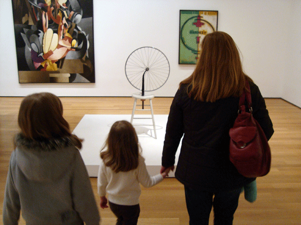
I dragged everyone into the Museum of Modern Art for the afternoon. The Daughters are still too young to have any real appreciation for what they’re seeing—to them, there’s no difference between what they see at MoMA and a poster they’d see in a restaurant—but I’m trying to plant little seeds of corruption. Plus, I get in free with my corporate ID. A real value, since admission is up to $20 bucks per adult!
There’s a big, BIG Abstract Expressionist exhibit running through April 25th. I’m not a huge Abstract Expressionist fan, but it’s as important a gathering of these works as you’ll ever see under one roof in your lifetime, so it’s worth a visit.
The first thing I did was hit ’em with an uppercut—Marcel Duchamp’s readymade sculpture Bicycle Wheel. I tried to explain how anything can be art and that it’s all very subjective and in the eye of the beholder, etc., etc. Then I started to bore myself, had mercy on them, and kept my mouth shut.
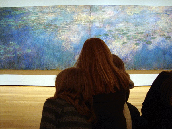
There’s a long room with a Monet water lilies triptych along one wall. The museum cleverly set a bench in front of it so people could sit and zone out. It really does calm your nerves and makes you yearn for a mug of warm milk and honey.
“Mommy, is that woman drowning?”
“Yes.”
“Why?”
“Because Brad broke her heart.”
“…?…!…?…What?!”
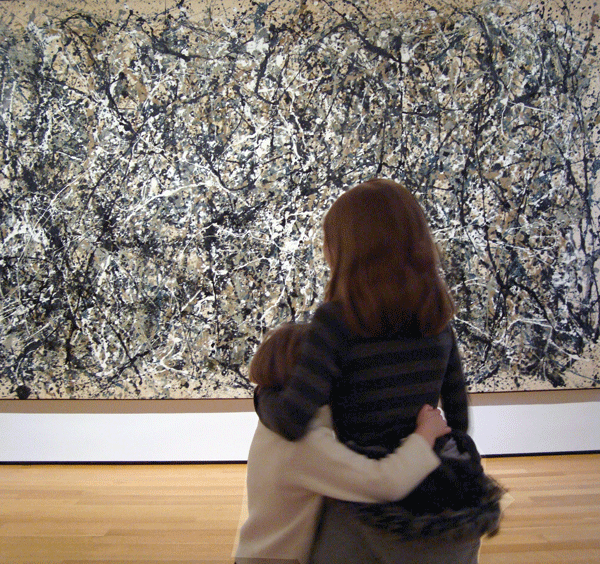
I was standing off to the side and overheard 9-Year Old Daughter explain to 4-Year Old Daughter that the artist put the canvas on the floor and dribbled paint all over it. Muuhahaha! My work is almost complete.
There’s a room full of Mark Rothko’s work. I like him a lot. He has one painting that he did over and over and over again, but it’s a good painting! (Kind of like the Rolling Stones, who have been reworking that one song for decades.) I heard a story once that some of Rothko’s works are done on untreated canvases and are simply fading away and cannot be saved. Can anyone confirm that?
The museum is an exhausting experience. Even *I* get wiped out after a while! But I choose to think of this as their commentary on these goddamn Ad Reinhardt monochrome paintings. ZZZzzzzzzzzzzzz.
The most beautiful work of art is, of course, the city itself. I think the MoMA architects knew that and created these windows that look like picture frames.
I paid a visit to the Whitney Museum of Art to take in their current exhibit, Modern Life: Edward Hopper and His Time. The Whitney has more Hoppers in their permanent collection than any other museum, so they trot them out on a fairly regular basis because they’re crowd pleasers. (Which is to say, revenue-generators.)
I’ve read that some folks complain but I don’t mind one bit. Call me pedestrian but I love Hopper’s work. The idea (this time) is to pair a selection of Hopper paintings with works from other artists who were his contemporaries. I believe the intention is to give the viewer a feeling of the moment in time when these pieces were created. Initially, it sounded like kind of a flimsy premise but I think the exhibit is a success.
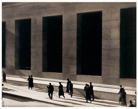
The majority of the painting on display are by Hopper but you also have works by Charles Demuth, Alfred Stieglitz, Ben Shahn, etc., etc. You’ll see this beauty, which was painted by Hopper in 1921…
…hung near this fantastic photograph of Wall Street that was taken in 1915 by Paul Strand. The pieces really do work in concert with one another and I’d like to see the show again before it closes in April.
* * *
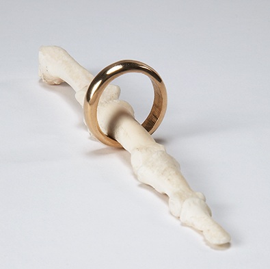
What I wasn’t expecting was to be blown away by another exhibit running through February 13th; Charles LeDray: workworkworkworkwork. I’m a bit of a traditionalist and a snob when it comes to museum exhibits. I’m not much for contemporary art, so it takes quite a bit for me to take notice. LeDray, who I knew nothing of walking into his exhibit, is a sculpture who creates objects to small scale. It looks like painstaking work but the end result is a fun romp.
The best piece is this miniature men’s clothing store. The clothing is hand-sewn miniatures. There’s a round table with a selection of tiny ties splayed out as you might see them in Macy’s. It’s impressively detailed work.
One of the mediums he works in is human bone. Apparently, you can get bone on the market. Somewhere. Not New York, I’m sure. I think there’s a deeper meaning attached to this wedding band on bone piece but my enjoyment is all right there on the surface.
This is a cricket cage carved from human bone. Again, what does it mean? I don’t know but it doesn’t rob me of any enjoyment.
LeDray created hundreds (thousands?) of tiny clay pots. There are three display cases. I would have liked to get a shot of the third case containing pots in a multitude of colors but the security guard was on to me. You can’t really tell how small these are because there’s nothing to reference the scale, but these are tiny, tiny pieces. I’m not sure how he accomplished this. If you happen to be in town visiting from a far-off land, it’s worth your time and effort to visit this before it closes. I’m talking to you, Dinah.
I meant an art exhibit, of course. What were you thinking?
The big museums are a good place to charge your batteries but you have to pay attention to the dozens (hundreds?) of smaller galleries that dot the city. There’s lots of satisfying work being produced that doesn’t make it into the mainstream. Plus, these smaller exhibits are less of a time commitment and, hence, less exhausting. I saw this one on my lunch hour! It beat the hell out of another baloney sandwich at my desk.
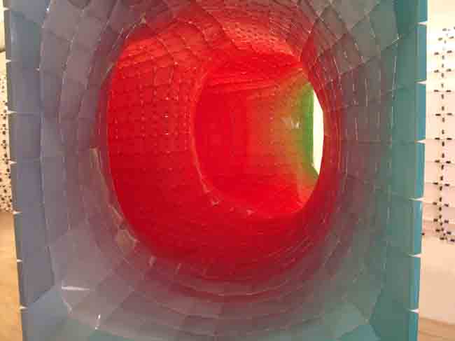
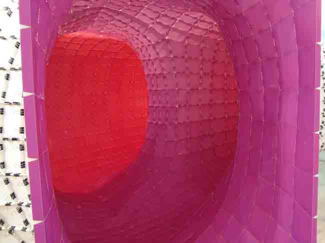
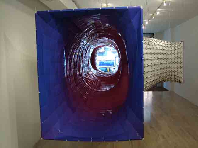
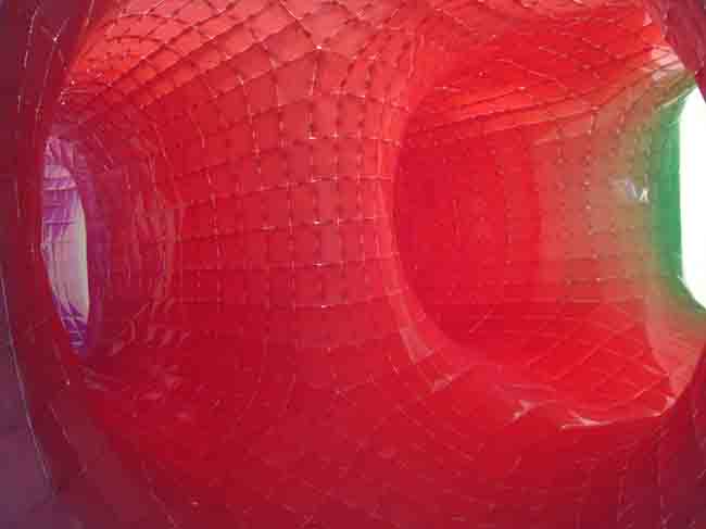
In the tiny Bridge Gallery on Orchard Street just south of Delancy, the folks at SOFTlab installed CHROMAtex.me. It was a site specific installation constructed from pieces of photo glossy ink jet printed paper. The largest portal of the piece faces the street. You feel the vortex suck you in as you walk by.
Each small piece of paper is precisely color coordinated so that once constructed, it produces a smooth blend from one shade to the next.
According to SOFTlab, there are over 4,000 pieces of paper used. As you walk around the piece, you can stick your head in the various portals and get different views of the color schemes.
Guess how the piece is held together? Binder clips! The anomaly is that the first thing you see when you walk in the gallery is how the piece is constructed. Normally, such mechanics are hidden from the viewer. The chaotic texture of the exterior is in stark contrast to the smooth interior.
The piece is suspended from the ceiling by barely visible wires, giving it a floaty, weightless feeling. How cool is that?
Thanks to JZ for pointing me in this direction. And he doesn’t even live here!