And by “I,” I mean “WE,” because there’s no way I could have pulled off a stunt like this on my own.
Back in 2003, I took a class in book binding and letterpress printing at the Center for Book Arts in Manhattan. I had been collecting for quite some time and began to wonder, as most collectors eventually do, how books are constructed. Especially the fancy ones.
That same year, British author Nick Hornby published Songbook. It’s a series of essays about songs that are meaningful to him. It’s still in print and it’s a pretty entertaining read. I’m a big fan of his work and have a healthy collection of signed first editions and rarities.
Songbook includes an essay on Bruce Springsteen’s Thunder Road that I think is particularly effective. It’s the standout piece of the book. I was in bookbinding class stabbing myself with a sewing needle trying to perfect a chapbook spine stitch when I had the spark of an idea. Wouldn’t it be cool, I thought, to create a chapbook that married both Hornby’s Thunder Road essay with Springsteen’s lyrics? And do it legitimately, with permission from the artists? Yeah, right. Like that could ever happen.
I bought a rare Charles Bukowski first edition from Jim, who lived in Phoenix, Arizona. As it turned out, he’s a letterpress printer. He creates beautiful, limited-run books at synaestheia press. He’s a design and production genius. I was a patron of his press and we became pretty good friends. He visited New York City, I visited Phoenix and we also met in Las Vegas once. We spoke all the time.
I told him about my crazy idea for the Thunder Road chapbook. He encouraged me and said that if I could somehow secure permission from Hornby and Springsteen, he would print it. Shortly thereafter, Hornby was on a promotional tour for Songbook. At his Manhattan stop, while getting my copy signed, I casually asked if I could reprint his Thunder Road essay in a chapbook. Much to my surprise, he said yes, with the stipulation that every penny made from the sale go to charity. That was okay by me, since making money never entered my mind. Not once!
Now the tough part. Bruce Springsteen’s business machine is fiercely protective of his material. I thought that going to him with an agreement from Hornby already in-hand would add legitimacy to the project. I wrote to his manager, Jon Landau, and not long thereafter, much to my complete shock, received permission to reprint the lyrics on a letterpress broadside. The stipulation was the same as the one Hornby set out for us; we were not permitted to profit from the venture. All proceeds had to be donated to charity.
We received nothing more than a verbal agreement and a “good luck” from Hornby, however, we received a multi-paged contract from the legal department of Shore Fire Media that we were required to sign and return. It was stipulated, in no uncertain terms, that all monies were to be donated to charity and that we were to use the lyrics provided with the contract (vs. getting them off the internet and possibly misquoting). Pretty serious stuff. The contracts were signed on May 28, 2004.
With my recently acquired knowledge of chapbook construction, I worked up about four different prototypes. The trick was to collapse both the essay and the broadside into one book. I sent them off to Phoenix and, if I’m being completely honest here, the layout ideas that Jim came up with were much better than mine. I wanted the book to be great so it required some humility on my part. The finished layout is probably 80% his talent and 20% my lucky guesses.
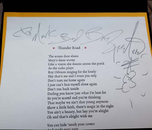
Do you know what can dramatically increase the value of a book? A signature. We had another brilliant, impossible, idea. We would fly to London, meet with Hornby, and he would sit and sign a stack of title pages for the essay portion of the book. In early 2006, I sent him, via his publisher at Penguin, a “Hey, remember me? We’re going to be in the neighborhood. How’d you like to sign some title pages?” e-mail. How many authors of Hornby’s stature do you suppose would entertain such a ludicrous request? Damn few, I’d guess. But he agreed to do it. On March 16, 2006, he had us over to his writing studio and for a few hours the three of us bullshitted about music and literature and the internet and he told us some fun stories about dealing with Hollywood, all while signing page after page after page after page.
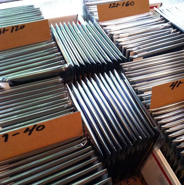
 We were planning a print run of 200 copies. Hornby signed 250 leaves. This is common practice as it allows for overage, contributor copies and damage during construction. Nick developed a terrible hand cramp. I felt kind of bad. Afterwards, he walked with us back to the tube station and took us past the vintage (1913), now demolished, Arsenal stadium, home to his beloved Gunners. It’s one of my top five favorite afternoons ever.
I sent a request to Springsteen asking if he would be willing to sign a portion of the broadsides. I didn’t dare hope that he’d sign all 250. He declined and I didn’t have the nerve to pursue the issue. Frankly, I was surprised that he granted permission to use the lyrics and I didn’t want to push my luck.
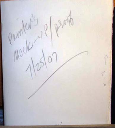
It took a little over a year to produce the printer’s mock-up proof. A year is a bit longer than is customary for this type of work, but there were delays.
 And then there were more delays. The months peeled away. I thought the project was becoming a burden, so I offered to find someone else to print it. But Jim is steadfast and a man of his word and always finishes what he starts. The printing commenced slowly.
I don’t recall the specifics (and wouldn’t share them here if I did) but eventually, tensions rose, words were exchanged and we stopped speaking. Our friendship died. And the Thunder Road chapbook project ceased.
In July of 2008 I wrote to Hornby and said that, with deepest regrets, the book would not be made. He wrote a short piece on his blog about how all artistic endeavors begin with good intentions but don’t always come to fruition or a happy ending. He used our book as a case in point.
Years passed by.
I wrote to Jim last fall and after a few tentative e-mail exchanges, I asked if he wouldn’t mind shipping the guts of the book. He had finished the essays and broadsides but the covers still needed to be printed and the book had to be assembled. He boxed them up carefully and they arrived in New Jersey sometime in December.

 * * *
* * *
I had some contacts in the letterpress community that led me to Ray at Lead Graffiti, an extraordinary letterpress printer in Delaware. I approached him about the project with the caveat that although I could cover the cost of materials, all the heavy lifting would have to be done pro bono. Would he be interested?
He embraced the project so enthusiastically that in addition to making the 200 softcovers, he decided to create a special run of 26 hardcovers that would sell at a premium. Ray’s partner, Jill, jumped in and created a beautiful linocut stamp of storm clouds to print on the cover.
Here’s Ray slaving away at the printing press.
I was moved by their enthusiasm for the project and willingness to create hardcovers. I meditated on how they could be made even more special. I approached Springsteen again and asked if he would be willing to sign the broadsides for just those 26 copies. He politely declined five years ago, but this time he said yes. I dropped the broadsides off at his house and picked them up several weeks later.
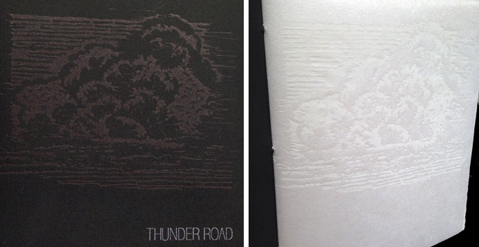
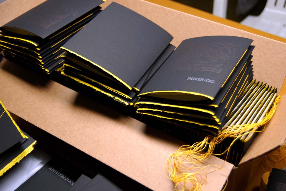
The book has two spines. The essay is bound in on the left spine, and the broadside with the lyrics unfolds from the right. We borrowed the same font from the Born to Run album cover for the title. The covers are printed on black Somerset Velvet and the flysheet for the essay is printed on white mulberry paper.

The linocut is printed black-on-black ink for the cover and repeated in white-on-white for the flysheet.
 A hand-rolled deckle edge that emulates yellow road paint was added along the bottom.
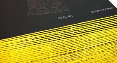 It’s sewn with matching yellow thread. The hardcovers have yellow endpapers.
 The 26 copies signed by both Springsteen and Hornby were priced at $225 and are sold out. But I still have the softcovers to sell. They are priced at $60 each; a steal considering the level of craftsmanship and the content. All copies are signed by Nick Hornby on his essay. Per Hornby and Springsteen’s request, proceeds from the sale are being donated to TreeHouse, a school in London for autistic children.
We created six special sets that are not for sale. One hardcover and one softcover are laid into a custom clam shell case, handmade by Bill of Bottle of Smoke Press, who also assisted with the cover printing. These sets go to Springsteen, Hornby and the four project participants. Bruce was kind enough to inscribe the broadsides for those six copies to each of us. Here’s my hardcover copy. Brothers and sisters, this is all the payment I’ll ever need.

Getting this book made has been a long, arduous process but the finished product is a small masterpiece. Hardbound copies were purchased for the special collection libraries at Columbia University, The University of Delaware and The Newark Library. There’s also a copy on hold for the Library of Congress.
Letterpress printing is a fading art form. There are no new Heidelberg Presses being manufactured. These books are created by craftsmen who are at the top of their game. They’re the polar opposite of cold, impersonal eBooks. Aside from the obvious “do-good” aspect, they are a prestige item. But it was very, very expensive to produce. And I don’t just mean the black Somerset Velvet, white mulberry paper and untold hours of uncompensated labor. This book annihilated a great friendship.
You can order a copy via PayPal. The account is ThunderRoadChapbook@gmail.com. [Please do not leave orders in the comments section.] I’ll start shipping copies sometime next week. If you really want to help out, throw a link up to this too-long post.
Please note: We are sold out. There are no books available. Thanks to all who purchased a copy.